Marla Frazee
Studio

Tools & Techniques
Illustrators spend a great deal of time discussing the type of paint, paper, and brushes they use. The fact is, our most important "tools and techniques" aren't purchased at the art store. They arise out of the study and understanding of picture book form, and they allow us to tell our stories... with pictures.
Style Like the author's "voice", illustrators possess a unique style. A personal way of seeing the world, a distinct drawing and/or painting quality, an ability to visually describe something that no one has shown to us in quite the same way before.
Characterization Whether our characters are cartooned, stylized, or realistic, they have to be TRUE. If we want our readers to feel deeply about our characters, we need to use everything we've discovered about ourselves and others, and show their humanity. We will know much more about them then we will ultimately show in the book, and that will give them depth. Plus, we've got to draw them consistently.
Setting Illustrators create a visual world the reader enters into. We turn the light on, and hopefully allow the reader to SEE the story being told.
Interpretation of Text The text and illustrations of a picture book combine to create a larger and more expansive meaning than the sum of its parts. The words tell part of the story, the pictures tell part of the story, and sometimes they may tell different stories.
Sequential Action By placing image after image, we are creating a visual narrative. We must control this narrative as much as the author who is writing sentence after sentence. What are we saying? Who is our main character? Have we gone off on a tangent? What is our point? Our central theme? Have we lost our readers? Are we repeating ourselves?
Pacing/Page Turn The illustrator usually determines the placement of word and image, and where the page turns will be. These decisions affect the tempo and rhythm of the book. The page turn serves a critical narrative function, unique to the picture book. The turning of the page brings on a fresh start, a new mood, thought, or day; a change. It accentuates the drama, anticipates surprises, and adds suspense.
Emotional Impact of Image Using color and composition, the illustrator can create emotional impact that may or may not be in the text. As with cinema, the combination of words and pictures create a more complete sensory experience. Somber or cheery tones, oppressive or minute forms, frenetic or calming imagery all greatly affect the story itself.
Size, Format, Layout The decision of whether a book should be large or small, horizontal or vertical, is determined by the nature of the text and its readership. The illustrator is responsible for envisioning the book as a physical object. Determining its size and structure, as well as the size and placement of the interior images is the foundation on which the entire story rests.
The Cover Since it is the most commercial (and least narrative) aspect of the book, the cover is unique. It is trying to get the reader/buyer to pick it up. It is the extrovert illustration, and often has to speak a bit louder and call a bit more attention to itself than one may wish.

Portfolio Tips
From: "Marla Frazee’s Tips on How to Prepare a Portfolio", Kite Tales, Society of Children’s Book Writers and Illustrators Los Angeles (Summer 2010 Volume 21 Number 3)
Q Should I have only one style in my portfolio?
A Borrowing the word that authors use to describe their writing, the best portfolios are unified by the illustrator’s “voice.” If every piece in your portfolio speaks clearly in your own unique voice, then it won’t matter if you sometimes use watercolor, sometimes work digitally, and sometimes are into collage or whatever.
Q How many pieces should I include?
A I suggest around 10 to 12 knock-their-socks-off pieces. It is better to leave the art director/editor craving to see more work than cringing about how many mediocre samples they still have to get through.
Q What are the ingredients for creating a winning portfolio that catches an art director’s/editor’s eye?
A Besides the element of a unique voice, the samples should be narrative and look as if they are from children’s books. Duh, right? Seems like a no-brainer, but you would not believe how many portfolios include work from greeting cards, portraiture, real estate ads, animation, textbooks – really anything. It is great to use your illustration skills to pay the bills, but make sure your children’s book portfolio is about children’s books.
Q What distinguishes great illustration from just good illustration?
A Oh, we all know it when we see it. I think when someone is doing exactly what they were put on this earth to do and when they are lost and relaxed in their process, we experience their work as “great.” It really applies to every vocation. Baking pies, laying bricks, children’s book illustration...
Q What ingredients make a picture book illustration intriguing/interesting to look at?
A A touch of mystery. A character who pulls us in emotionally. An unusual approach to the storytelling. Mastery in execution.
Q What is more important, style or concept?
A I think the most important thing is emotional engagement. Have you made the viewer care about whatever is going on in the image?
Q What should an illustrator for children be sure to include in a portfolio?
A Anything that the illustrator loves so much that they seem as if they totally get the essence of whatever it is they are portraying. We are beyond the days of saying you need to have b/w, children, pets, everyday scenes. If you are into wombats, and that’s all you care about, then by all means, have a wombat-driven portfolio.
Q Should I include sketches in my portfolio? Character designs?
A Yes, include sketches. It is helpful for art directors/editors to see your process and how you think. And yes, include characters, but only if they are honest-to-goodness characters. Nothing generic, overtly commercial, or stereotypical.
Q Is it important to have a dummy with my portfolio?
A It is helpful to have, if not an entire dummy, samples that demonstrate your mastery over how you address the book form – type, the gutter, double-page spreads, page turns, character consistency from page to page, and jacket design. All of your samples should address the book form in one way or another.
Q How important is the presentation? Quality of reproductions?
A I think the only thing that’s important about this is that you make it easy for the art director/editor to view and enjoy the portfolio. Be clean. Be clear. Be organized. Don’t make any aspect of viewing your work tedious for the person who is looking at it.
Q If an illustrator is new to the field, should she or he consider including a portfolio in the showing at the conference? What are the advantages or disadvantages?
A Sure. It is all a learning experience. Putting your work out there and seeing how it compares to others is a crucial step in the process. The only disadvantage is potential embarrassment or humiliation. And sometimes that is exactly what we need to experience in order to get ourselves to take it up a notch.
Q What is the most important question about portfolios illustrators forget to ask?
A Is my work good enough, yet?
Thumbnail Sketches
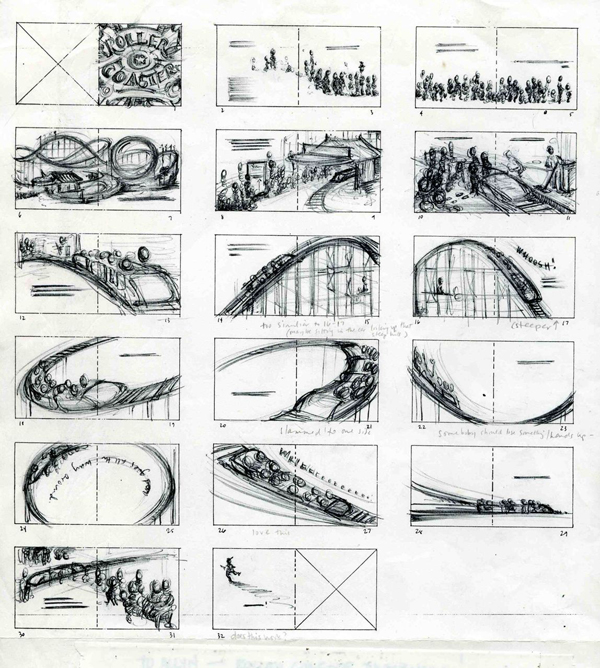
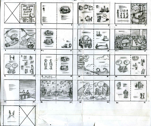
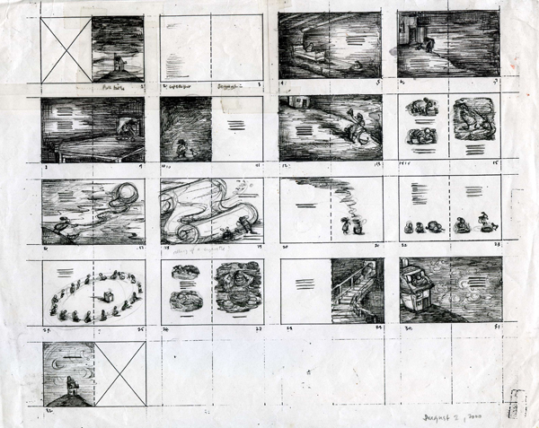
I like to impose a structure on my books early in the process. I usually work this out in thumbnail sketches – deciding where the page turns will be, how the words and pictures will relate to each other on the page, where the drama will build, and what the overall design of the book will be. To me, this is the most dynamic stage of the book's development. Below are thumbnails from Roller Coaster, A Couple of Boys Have the Best Week Ever, and Mrs. Biddlebox.
Characterization
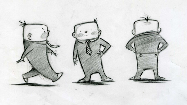
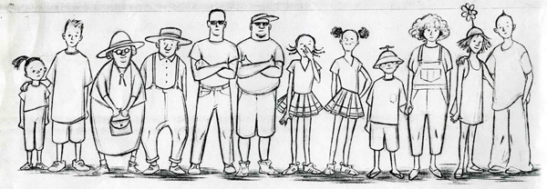
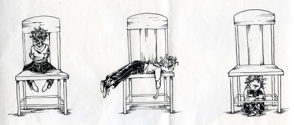
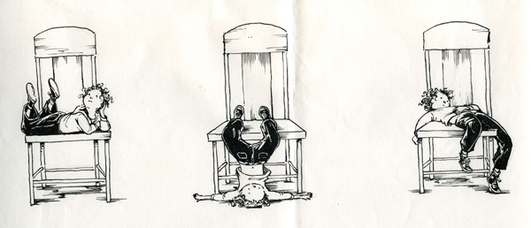
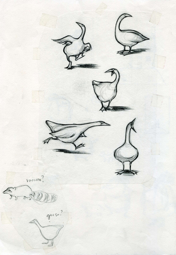
My first efforts at drawing characters are always stereotypical and generic, but once I spend time getting to know the character, the drawings eventually deepen and become more alive. It is a matter of exploring details (which illuminate personality), emotions (which the reader will identify with), and quirks of behavior (which will hopefully make the character feel like our friend). Below are studies from The Boss Baby, Roller Coaster, The Clementine Series, and Mrs. Biddlebox.
